Experian Partner Solutions had never offered a freemium product before. Digital Identity Manager would scan 80+ people-finder sites to show existing customers their exposed personal information, then convert them to paid continuous monitoring and automated removals.
40%Interaction rate
8%Free-to-paid conversion
Product Design Lead · Experian Partner Solutions · 2023
Background
The constraints I had to design within
Experian Partner Solutions operates on a B2B2C model — it builds white-labeled identity protection products that banks, insurers, and other organizations offer to their customers. End users access the product through a partner-branded portal, which means any product must simultaneously serve both the partner’s business goals and the end user’s needs.
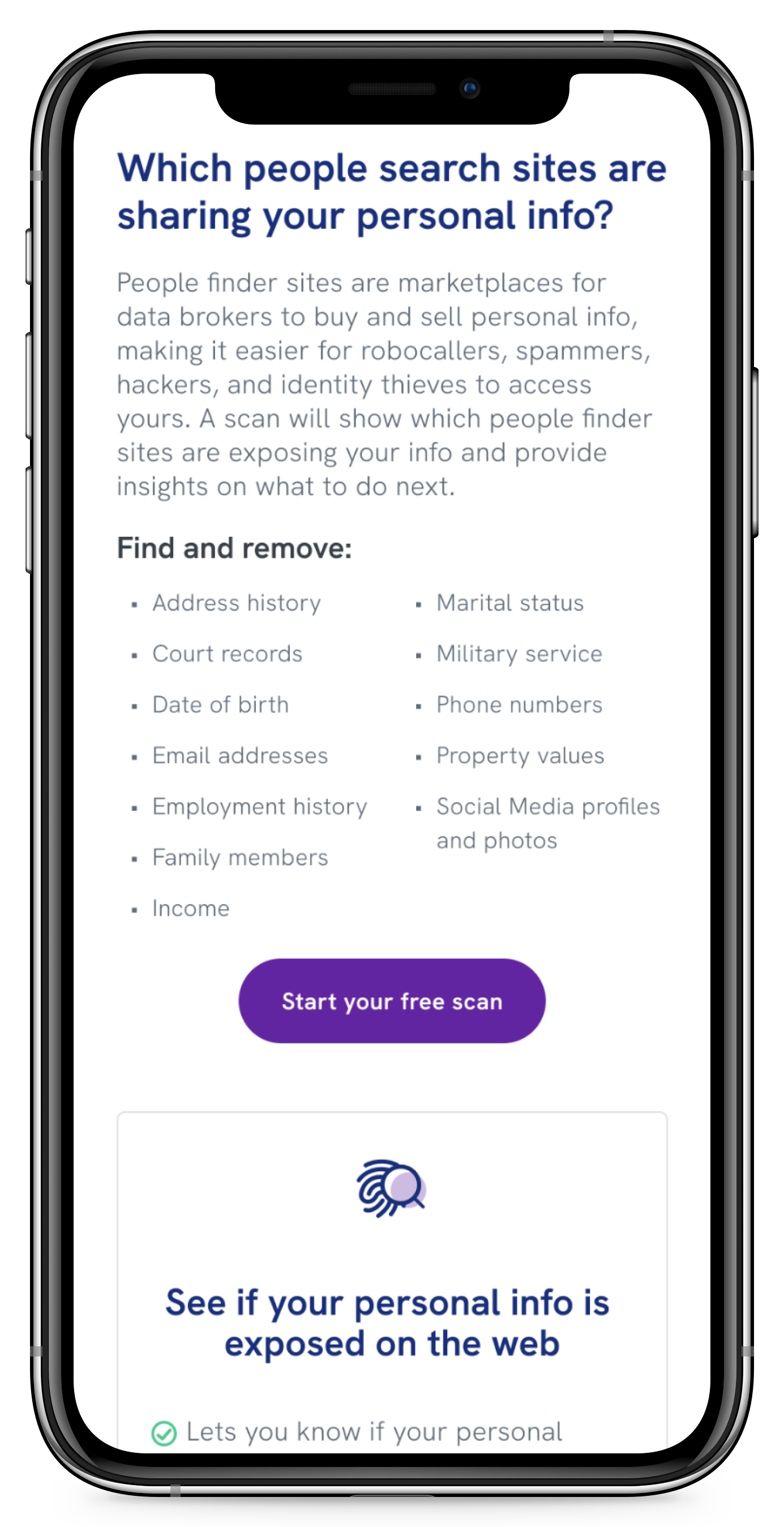
People-finder sites are data brokers that collect personal information from public records and sell it openly — addresses, phone numbers, relatives, property values. With just a name and a city, anyone can build a detailed dossier. Most users have no idea these sites exist and that they are actively selling their personal information, which makes the exposure difficult to act on and easy to ignore.
The Challenge
Partner business objectives vs. user trust
Partners were invested in strong conversion numbers — a freemium product was an opportunity to grow paid subscriptions, and they wanted it to perform. But identity protection is a category where users are already cautious, and an aggressive upsell would undermine the product before it could work.
My role
I led the end‑to‑end design process: clarifying the problem space and third‑party vendor capabilities, defining product scope and mapping key user flows, writing a large portion of the user‑facing copy, creating the interface design and design system components, running usability testing in collaboration with a senior researcher, and overseeing handoff to development.
CompanyExperian Partner Solutions
My roleProduct Design Lead
TeamProduct Owner, Senior Researcher, Engineering
Launch2023
The Design
Designing for confidence & clarity
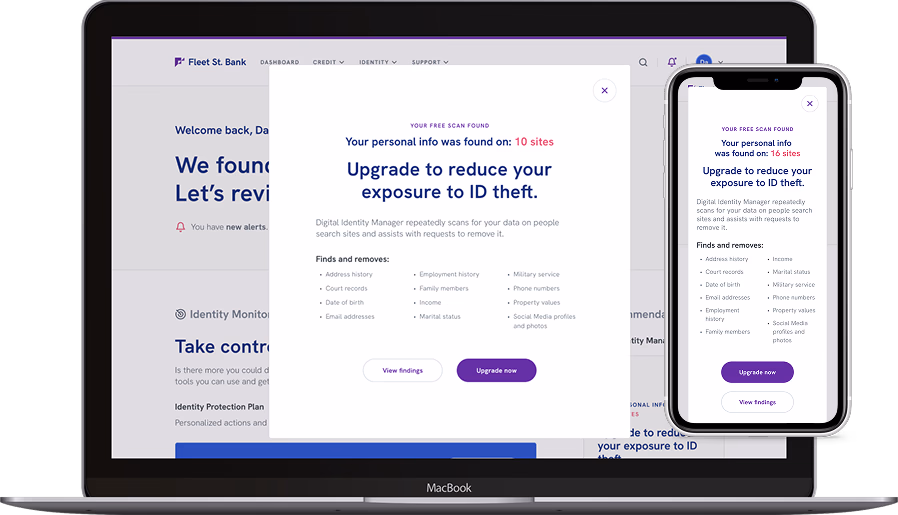
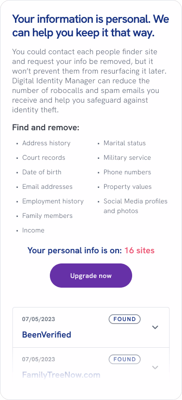
Most users had no idea people-finder sites existed, let alone that their personal information was being sold on them. Abstract explanations of the risk didn’t change that — in testing, people skimmed right past them. What did land was seeing their own data exposed in a free scan. We built the experience around that moment.
Through two rounds of testing, we uncovered three drop-off points standing between users and conversion. Each required a fundamentally different approach to overcome.
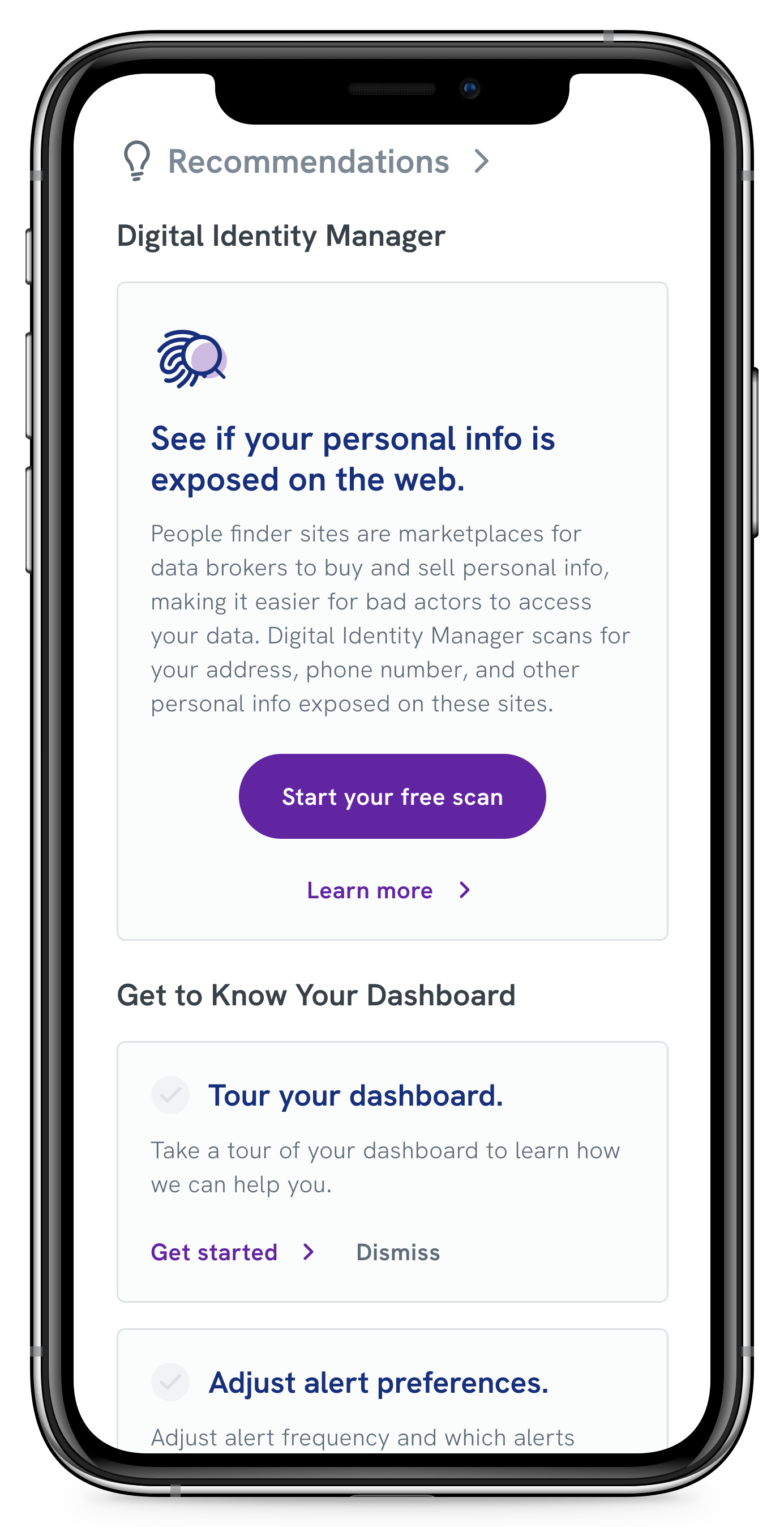
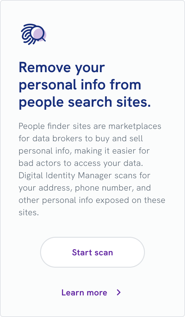
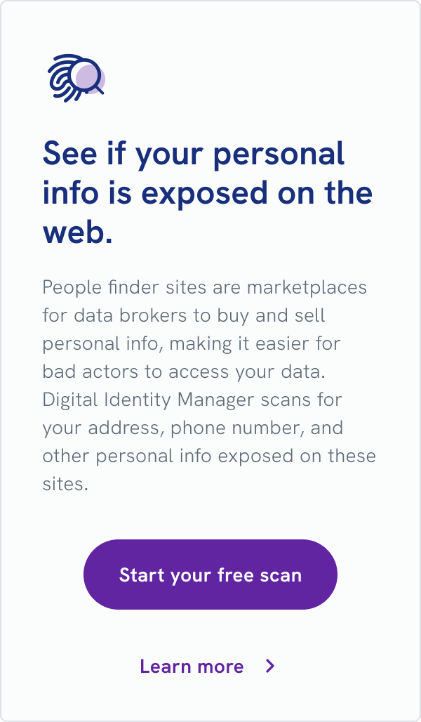
Dashboard right rail card
Before opting into the free scan, a card on the dashboard includes a call to action and a link to more information.
Product page pre-scan
The “Learn More” link directs you to the product page, where you can find additional information.
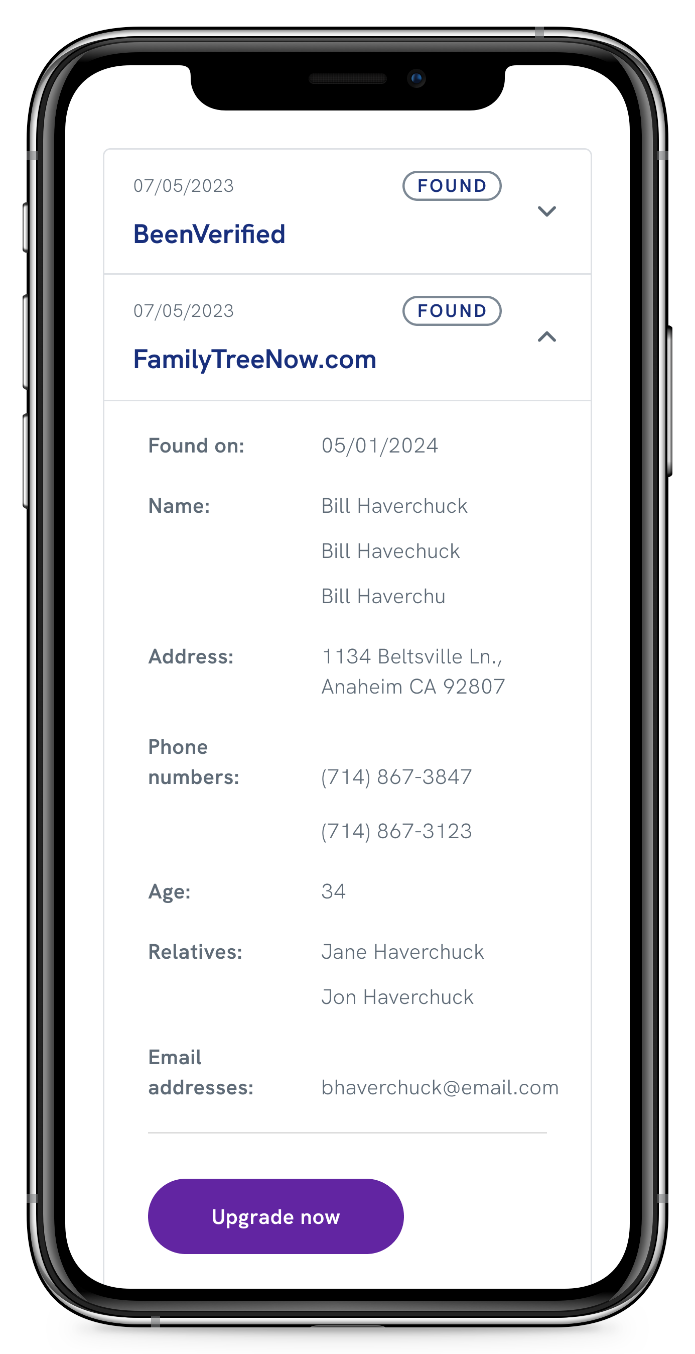
Free scan results
After the user opts into the scan, the product displays a static set of results, the value proposition of the paid version, and a CTA.
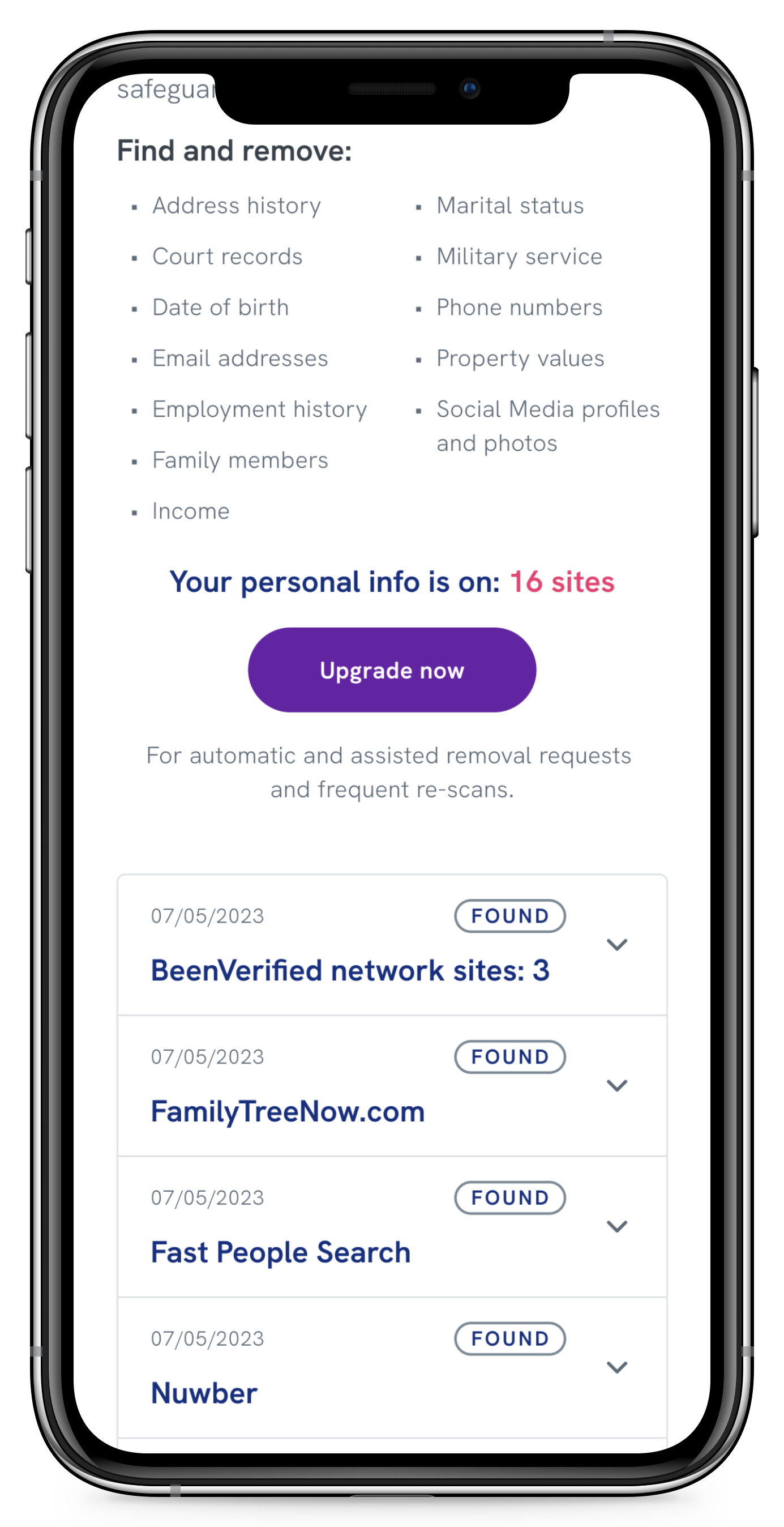
Scan findings details
Expanding one of the accordions displays all of the user’s information on the people-finder sites.
From invisible to irresistible
Users overlooked the dashboard card call to action
In Round 1 of usability testing, only 4 out of 29 participants (14%) selected the free scan widget as their first choice on the dashboard. The right-side widget format wasn’t capturing attention, and my initial approach of explaining what DIM was up front fell flat — abstract explanations didn’t prompt anyone to click. The widget was competing with higher-priority dashboard items and leading with information instead of intrigue; users had no reason to engage until they already understood why they should.
Rather than making the placement more aggressive, I focused on making the widget more compelling. I shifted the headline from instructive to curiosity-driven, made the CTA button visually prominent with “FREE” front and center, replaced abstract threat language with specific data types, and removed any reference to premium features before users had even seen the problem. In Round 2 testing, all participants engaged with the free scan, up from 14% in Round 1. Curiosity worked better than explanation.
“I like that there is an option to see what information is available for free to really demonstrate how much could be out there and the option for upgrading…and have someone handle it for you.”
— Participant 3, Florida
Before
Headline lacks context Button is hard to see; text is not compelling
After
Headline is intriguing even without context Prominent button with compelling text
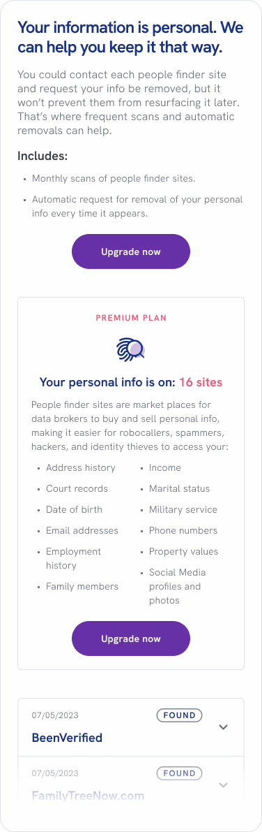
Making the threat feel real
Users didn’t understand the significance of their exposed data
Users could see their information was “found” on people-finder sites, but the personal consequences didn’t register. The original messaging focused on product features (monthly scans, automatic removals) rather than user impact. Without understanding the threat, they had no motivation to upgrade.
I removed the feature-focused “Includes” section and restructured the results page to lead with personal impact: reducing robocalls and spam emails, safeguarding against identity theft. I moved the list of exposed data types to a more prominent position directly below that statement, sequencing the message so that each piece earned the next — personal consequence first, then exposed data, then criminal use. Testing confirmed that connecting exposed data to personal consequences created immediate motivation to act.
“I felt confident in the information that was being provided to me, it made me feel like there was something immediate I could do to change my cyber security in a positive way.”
— Participant 4, Illinois
Before
Feature-focused scan results page
After
Consequence-led scan results page
From confusion to clarity
Users missed the key benefit of upgrading
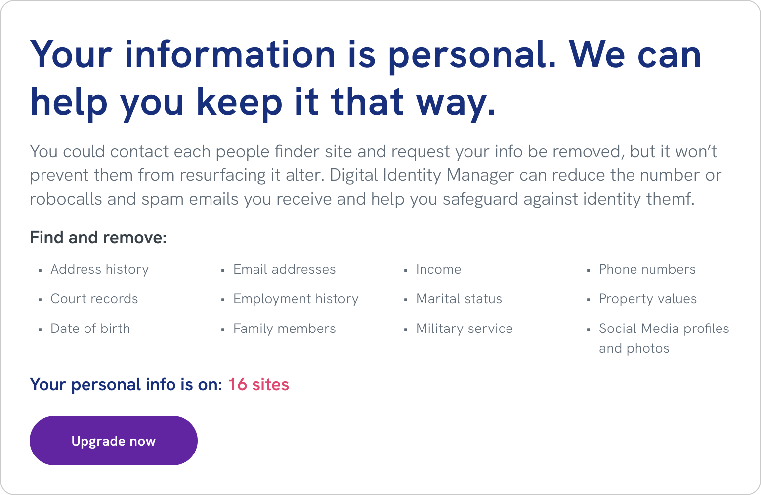
In Round 2 testing, most participants didn’t understand what they’d get by upgrading to the premium plan. They assumed it meant access to more detailed scan results, the ability to scan additional sites, or different types of data searches — missing the actual benefit: automatic removal of their data, not just viewing what was exposed.
This was partly a consequence of the previous design decision. By shifting focus from product features to emotional impact, I had successfully helped users understand the threat but overcorrected, burying the practical benefit of upgrading too deeply. I redesigned the upgrade messaging to balance both: a question-based headline framed the upgrade as answering something users now actively cared about, and an explicit benefit statement below the CTA made the solution mechanism impossible to miss — “For automatic and assisted removal requests and frequent re-scans.”
“I really liked how the site was giving me the tools and information I needed to feel like I have control over my identity and that I can control who has my personal information.”
— Participant 7, New York
Before
Emotionally-led upgrade screen
After
Emotion + explicit benefit upgrade screen
Unexpected Challenge
When data brokers fought back
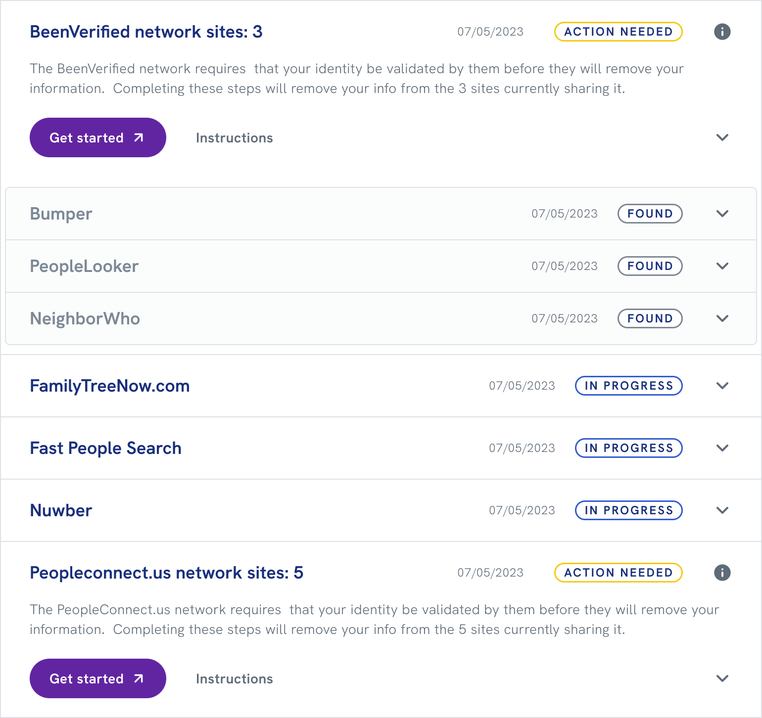
Just as I was wrapping up, two people-finder networks began requiring users to prove ownership by validating their email directly on their sites, bypassing our automated removal entirely. This created two immediate design problems: helping users distinguish between regular sites and network sites, and guiding them through a validation process on an external site we didn’t control.
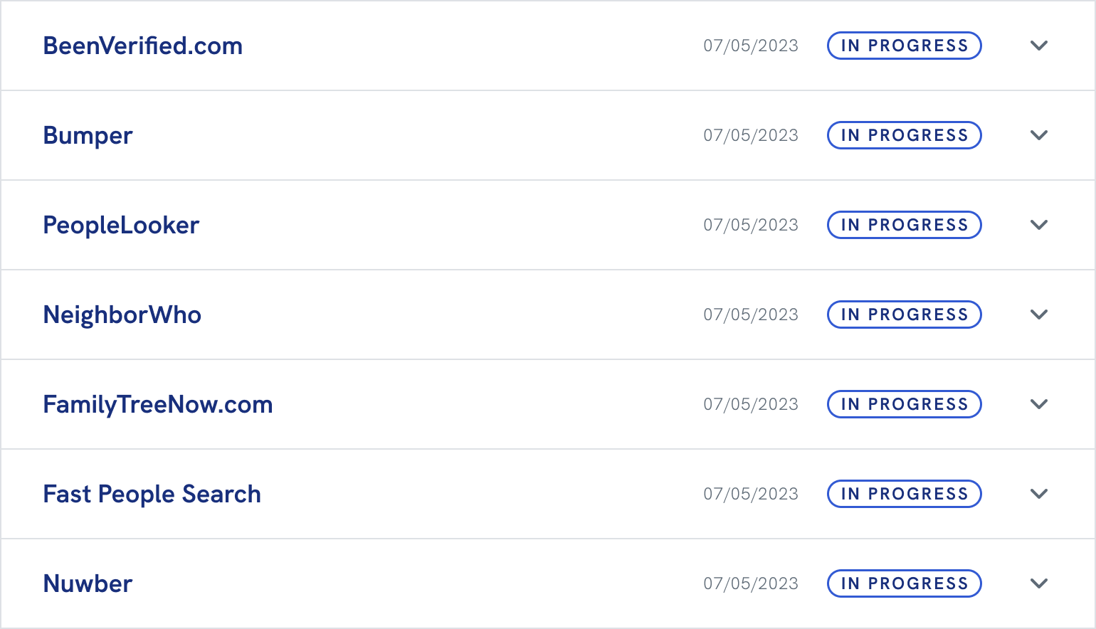
Networks started blocking automated removals
The existing accordion design treated all sites equally. Users had no way to know why some sites required action while others didn’t, or that validating once on a parent network would resolve multiple child sites beneath it. Rather than overhauling the entire design, I created a nested version of the existing accordion pattern. Network sites and their children were grouped into parent containers with “action needed” status, accompanied by links and step-by-step validation instructions. A single validation visibly resolved all child sites in a network, making the manual process feel manageable while staying consistent with the existing design system.
Before
Flat accordion list with only stand alone sites. All sites treated the same.
After
Nested accordion with both network parent/child sites and stand alone sites. Action needed on network parent sites only.
Status remained stuck on “action needed”
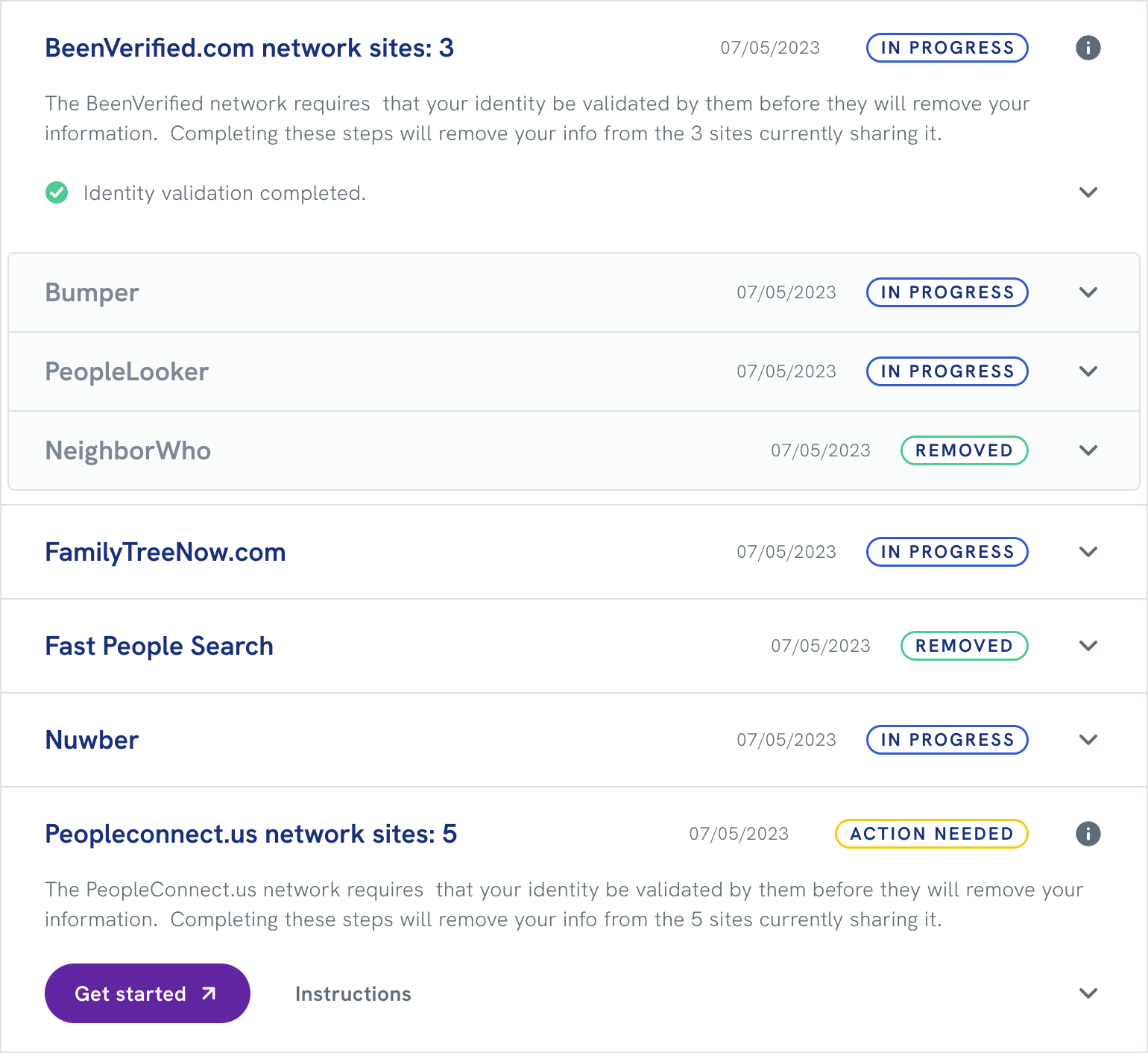
Even with clear instructions in place, we hit a basic technical problem: the email validation happened entirely on the people-finder network’s site. Because it occurred outside our system, we had no direct way to know when a user had completed it, so the status never updated, leaving users uncertain whether anything had worked.
I realized that since we continuously rescanned all sites, detecting data removed from even one child site within a network meant the user must have completed validation. I worked with developers to implement logic that inferred the parent network’s status from removal patterns across child sites. Once we detected that the network had removed all child sites, the parent status automatically updated to “completed,” giving users the closure they needed without requiring direct integration with external networks.
Top network site has a child in “removed” status, so the “in progress” status is inferred for the parent and siblings. Bottom network site has no activity, so it is assumed the user has not validated there yet. Stand-alone sites accept automated removals so we can track their status directly.
Impact
What the trust-first approach delivered
Digital Identity Manager launched with strong partner adoption, generating millions in B2B revenue. It showed value first, then asked for commitment — and that approach worked for both users and the business.
40%
Free scan engagement
The curiosity-driven approach successfully motivated users to engage with the free scan, transforming abstract privacy concerns into tangible awareness of personal data exposure.
8%
Free-to-paid conversion
Users who saw their data exposed were motivated to upgrade for continuous protection and automated removal.
<1%
Churn rate
Fewer than 100 service calls across the entire user base demonstrated that the experience was intuitive and met user expectations.
99%
Removal success rate
Automated and manual removal processes across 80+ people-finder sites proved highly effective.
Millions in new B2B revenue
Partners successfully adopted Digital Identity Manager, validating that a trust-first design approach could still deliver strong commercial outcomes.
A reusable freemium model
The project gave Experian Partner Solutions a pattern for converting free users to paid subscribers without sacrificing trust — one applicable to future products.
Conclusion
Takeaways
Curiosity outperforms explanation
Telling users what the product does didn’t move them. Showing them what was already out there did. The shift from instructive to intriguing copy — across the dashboard card, the results page, and the upgrade flow — was the most consistent lever we had.
Emotional framing needs a practical landing
Helping users feel the threat was necessary, but not sufficient. When I focused too much on the emotional message, I buried the solution. The best moments in this product balanced both: here’s what’s exposed, here’s what it means, here’s what we’ll do about it.
Constraints can sharpen design
The network blocking problem arrived late and could have derailed the product. Working within the existing accordion pattern, rather than rebuilding from scratch, kept delivery on track and produced a solution better than what I’d have designed with unlimited time.