FICO Score Planner

Clarity over novelty

A marquee partner was considering leaving their current provider for a FICO Score Planner — a tool Experian didn’t have. Two months, a black-box API, and a legacy platform later, we closed the deal. The feature now serves 19,000 users daily.

19K Daily active users
20% Plan completion rate
+33pts Avg credit score increase

Product Design Lead · Experian Partner Solutions · 2023

Background

From competitive gap to competitive edge

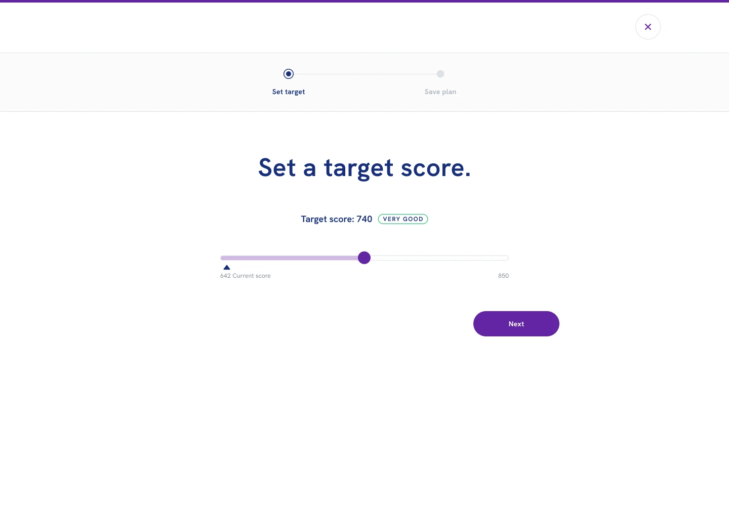
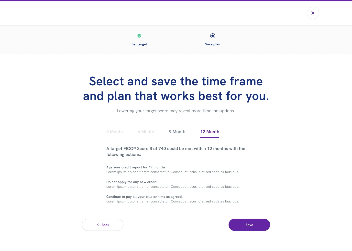
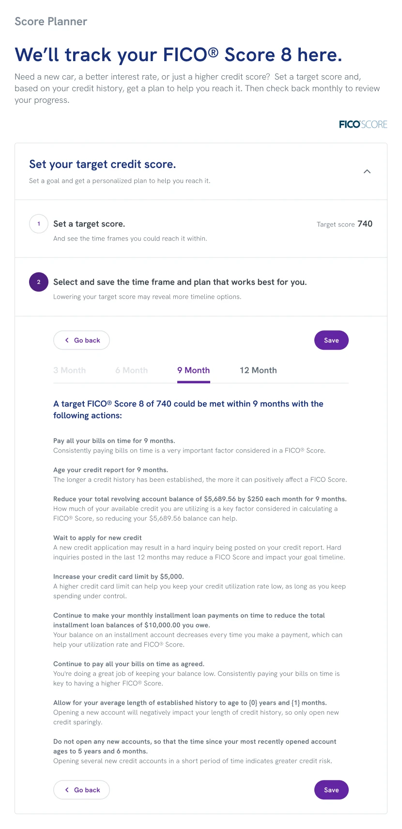
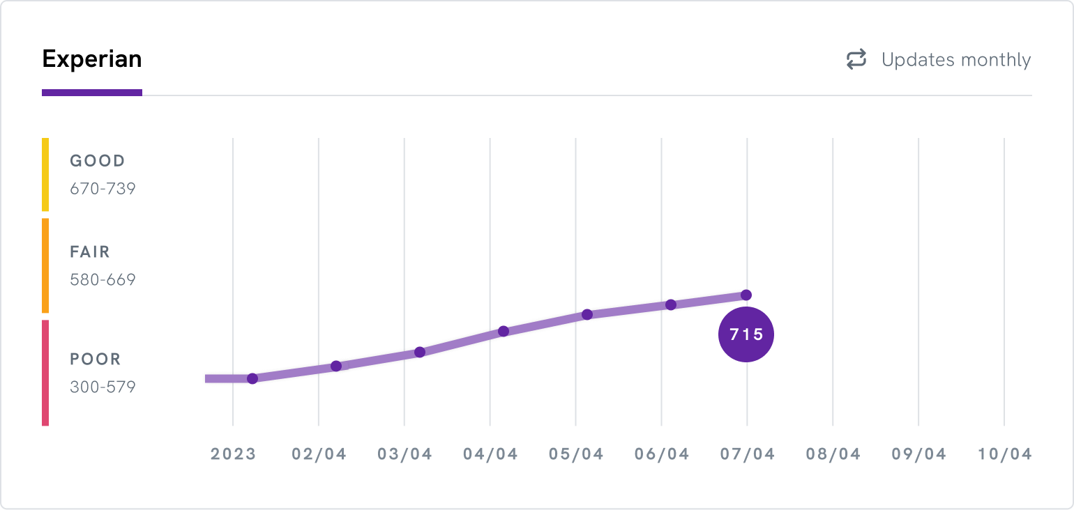
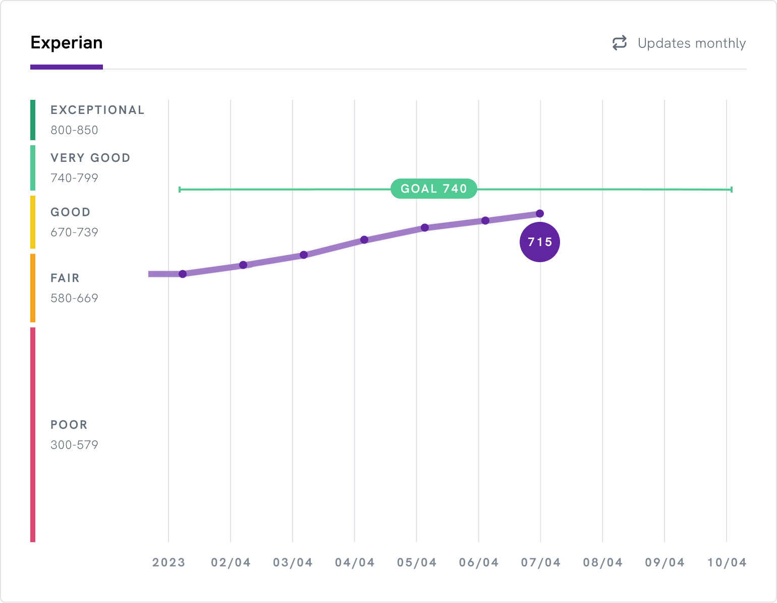
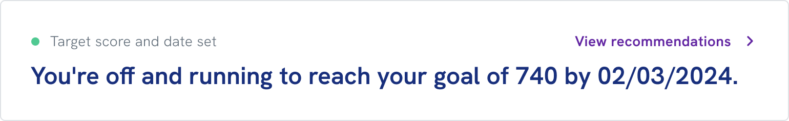
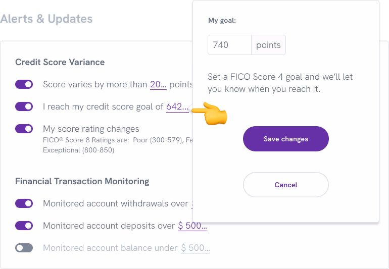
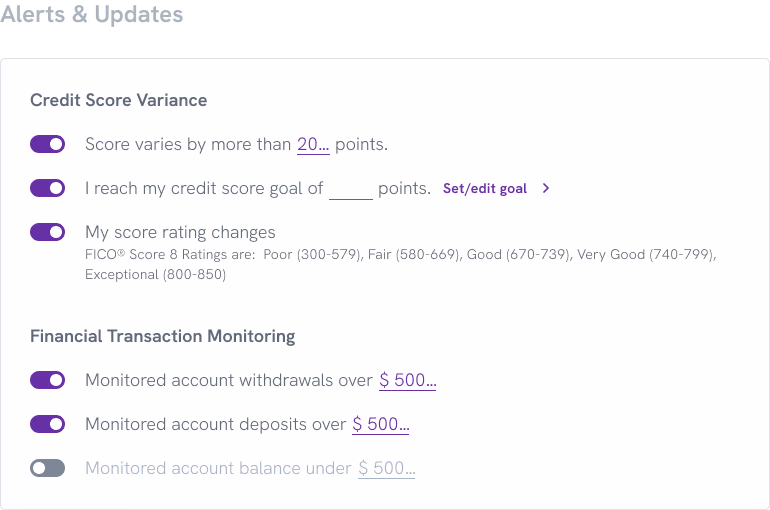
Experian Partner Solutions provides a platform of financial wellness tools that partners brand and offer directly to their users. A Score Planner lets users set a target FICO Score, understand what actions could help them reach it, and track their progress over time — turning an abstract number into a goal with a path.

The gap was two-layered: a key competitor offered a Score Planner, but only for VantageScore. A marquee partner wanted FICO — and we had nothing to offer. Building it would close the deal and fill a genuine product gap across the entire EPS partner network.
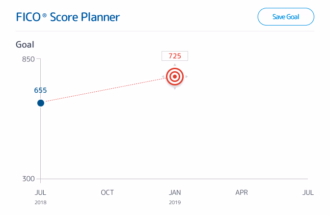
Competitor 1 — draggable target with unclear constraints

Competitor 1

The red target is draggable, but there is no indication of the restrictions: the target score must be at least 10 points higher than the current score, and not all timeframes are available for every target.
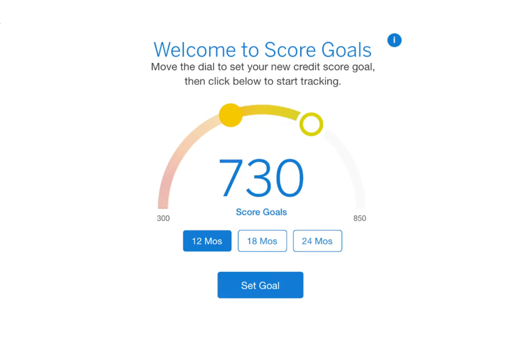
Competitor 2 — slider arc multi-step selection

Competitor 2

The user selects a timeframe, then uses the slider arc to set the score goal, and clicks to set it. Once a goal is set, the steps needed to achieve it are revealed.

The Challenge

Designing for the full spectrum

Although one partner opportunity prompted the build, any EPS feature eventually becomes available across all partners — meaning we were designing for a vast, diverse user base. Credit management is genuinely consequential. The people using this tool would range from financially comfortable users optimizing their score to people in real financial difficulty seeking a foothold.

The constraints were clear from the start: the underlying API was a black box we couldn’t modify, we were building on a legacy platform, and every competitor I audited had addressed the same design challenge with novel visual interfaces that largely caused confusion. The opportunity wasn’t to be more creative than our competitors. It was to be clearer.

My role

I led the design of FICO Score Planner from start to finish over two months. I shaped the project timeline, defined the user flows, designed the interface, wrote the content and interaction logic, and owned the handoff to development. I collaborated with a Senior Researcher who conducted usability testing, a Product Owner who managed the business requirements, and the development team who built and shipped the feature.

Company Experian Partner Solutions
My role Product Design Lead
Team Product Owner, Senior Researcher, Engineering
Timeline 2 months

“So, for just improving my score as a target goal, this would be really helpful.”

— Participant 1, Kansas

The Design

Three problems, one principle

The competitive audit and platform constraints surfaced three design problems. Each had a different solution, but all three were guided by the same principle established in the audit: clarity over novelty.

Problem
Approach
Success Metrics
Pattern

The standard modal pattern left the initial state nearly empty and buried the relationship between the two inputs.

A/B test modal vs. progressive disclosure with five participants.

  • Task completion speed
  • Participant preference
Visual interest

The feature had no inherent visual engagement; competitors had tried to solve this with novel interfaces.

Enhance the existing score chart with a goal line; resolve design debt in the same update.

  • Visual clarity
  • Design debt addressed
Dynamic content

The feature had no inherent visual engagement; competitors had tried to solve this with novel interfaces.

Write progress-based headlines; work with dev to surface the right message based on score progress.

  • Users have a reason to return
  • Feature feels alive over time

Choose the right pattern

The modal was overkill

EPS features typically use a modal for data input. But Score Planner’s second step involved choosing from up to four plan options, each with significant content. Fitting it into a modal meant either a wizard with multiple screens or enabling scrolling — adding friction to what should be a two-step flow.

I built clickable prototypes of both approaches — a modal wizard and a progressive disclosure alternative where the second input only appeared after the first was set — and worked with the Senior Researcher to test them with five participants.

Three of five participants preferred the progressive version, completing the task in an average of 1:35, compared to 2:57 for the modal. Participants favored it because the full flow was visible at once without navigating multiple screens. I chose progressive disclosure as the pattern for Score Planner and added it to the EPS design library for future use.

Modal approach screen 1 — set goal Modal approach screen 2 — choose plan

Option 1

Modal approach — two-screen wizard

Progressive disclosure — single view, inputs appear in sequence

Option 2

Progressive disclosure — single view, inputs appear in sequence

“I prefer to have the entire overview right there instead of a few different pages.”

— Participant 3, California

Add visual interest without adding confusion

One update, two problems solved

The feature needed visual engagement. Without it, the page would feel sparse and static. But the competitive audit had shown a consistent pattern: designers reaching for novel visual interfaces — draggable targets, curved sliders — that were interesting but not immediately self-evident.

Rather than invent something new, I looked at what we already had. EPS had an existing pattern for displaying a user’s credit score over time as a chart. I added a goal line representing the user’s target score, giving the feature a visual anchor. The update also gave the development team an opportunity to fix a known issue with the pattern: the chart’s scale had been truncated, losing context at the top and bottom of the range. Both problems addressed in a single pass.

Before — truncated scale, no goal line

Before

Scale is truncated and context is lost at the top and bottom of the range.

After — full scale revealed, goal line added

After

Full scale is revealed and goal line is added, making progress toward the target immediately readable.

Make static content dynamic

The API went silent after setup

Once a user sets their goal, the vendor API has nothing more to offer. The feature could remain unchanged for up to a year — meaning a user who returned to check on their plan would find exactly what they left. For a tool meant to motivate behavior change over time, that was a significant gap.

The API couldn’t be modified, but the front end could. I wrote a set of progress-based headlines calibrated to where a user stood relative to their goal: just starting out, making progress, nearly there, achieved. I worked with a developer to implement simple detection logic that surfaced the appropriate message as the user’s score changed over time.

Status state 0 Status state 1 Status state 2 Status state 3
Status state 4 Status state 5 Status state 6 Status state 7

Progress headline states based on where the user stands relative to their goal. Updated automatically as their score changes.

Beyond Scope

Eliminating a duplicate entry point

While working on the feature, I discovered that an existing alert preference setting already allowed users to set a credit score target — completely separate from the new Score Planner. Left unaddressed, users would have two unconnected places to enter the same information, with no indication that one affected the other.

I worked with a developer to implement detection logic that identified when a user had both active. For those users, the alert-setting input was replaced with a call to action directing them to Score Planner, where they could set and manage their goal in one place. The score set in Score Planner automatically synced to their alert preferences, eliminating the redundancy without removing any functionality.

This wasn’t in the original scope. It came from paying attention during implementation and treating a potential source of confusion as a problem worth solving before it reached users.

Before — existing alert setting with separate score target input

Before

Existing alert setting resulted in a second unrelated place to enter a credit goal.

After — alert setting replaced with link to Score Planner

After

New variant removes the input and adds a link to Score Planner for goal management in one place.

Impact

Closing the deal, and then some

A marquee partner was ready to leave their current provider for a FICO Score Planner. We built one in two months, won the deal, and the feature has since grown into a platform-wide offering serving tens of thousands of users daily.

19,000 daily users

Strong early adoption

The feature launched with a single partner and scaled quickly, recording 19,000 unique users per day on Score Planner alone, compared to 120,000 total daily logins.

20% plan completion

Goal-setting took hold

One in five users who engaged with the tool saved a plan — a strong signal for a feature built around voluntary goal-setting.

+33 points

Scores moved

Experian’s data show an average increase in credit score of 33 points for enrolled users, with 59% of one major bank partner’s customers seeing improvement.

Platform improvements

One fix, three wins

One build fixed three platform-level issues: a new design pattern was added to the library, a longstanding chart scale issue was resolved, and a front-end approach to dynamic content that required no API changes.

Conclusion

Takeaways

Small projects deserve strategic thinking

The scope was tight, the timeline was short, and the constraints were real — but the decisions made within those boundaries had consequences well beyond the feature itself.

Competitive analysis is a design tool

The audit didn’t just confirm that we needed the feature; it showed us exactly what not to do. Every competitor had reached for visual novelty and paid for it in user confusion. That finding shaped the entire design philosophy.

Constraints can improve outcomes

The black-box API was the most significant limitation and produced the most interesting solution. Because we couldn’t modify the vendor’s output, we solved the dynamic content problem entirely on the front end — simpler, more maintainable, and faster to build.

Pattern thinking multiplies impact

Progressive disclosure wasn’t just a solution for Score Planner — it became a platform pattern. One small feature decision created value for every future project that needed it.